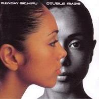
JSngry Posted November 2, 2007 Report Posted November 2, 2007 Why does this album cover: Put me in mind of this one: Is it the similarity in color scheme, is ther something more subliminal at work, or is it just me? Looking for some real insight here into the finer points of design/etc. if there's any to be had., seriously. As always, thanks in advance! Quote
Chas Posted November 3, 2007 Report Posted November 3, 2007 Tight headshots of serious visages (signified by closed mouths) , with overhead lighting giving a chiaroscuro effect . Quote
WD45 Posted November 3, 2007 Report Posted November 3, 2007 I say that the Shorter has an added level of profundity / relevance due to the album's title. Quote
AndrewHill Posted November 3, 2007 Report Posted November 3, 2007 (edited) It may be helpful to see the entire photograph. I know what the entire Shorter photo looks like. Do we have the entire photo of the other dude? For all we know, he could've been getting ready to blow candles out on his birthday cake. Edit to say that of course Wayne was not originally blue, but it was the best I could do. Edited November 3, 2007 by Holy Ghost Quote
AndrewHill Posted November 3, 2007 Report Posted November 3, 2007 One of my favorite Shorter albums by the way Quote
marcello Posted November 3, 2007 Report Posted November 3, 2007 Why does this album cover: Put me in mind of this one: Is it the similarity in color scheme, is ther something more subliminal at work, or is it just me? Looking for some real insight here into the finer points of design/etc. if there's any to be had., seriously. As always, thanks in advance! In portraiture, they both have almost 3/4 lighting. Above left lighting that cast a 1/4 shadow on the top right, between the eyes and the nose. Classic lighting that you learn very early in art class. Other wise, both men look al ittle simular and might be the same age. By the way, who is the bass player who copied this jaco portrait for his record recently? He's a west coast guy. Quote
kenny weir Posted November 3, 2007 Report Posted November 3, 2007 From my lifelong newspapering gig, I look at it from the perspective of the typefaces - alternating white and brown/orange. Although one is serif and one sans serif. Quote
Tom Storer Posted November 3, 2007 Report Posted November 3, 2007 I've never been very visual, so when I saw Jim's question I thought, "Because they look similar"--two faces, close up so the eyes, nose and mouth fill most of the picture, kind of moody looking. Then the visual descriptions from various people refined the answer with details on just how they look similar. But the typeface! Yes! I hadn't even noticed that the font colors are the same. I'm sure that's the clincher. Quote
sidewinder Posted November 3, 2007 Report Posted November 3, 2007 It may be helpful to see the entire photograph. I know what the entire Shorter photo looks like. Taken by Wolff at the Lee Morgan 'Search For The New Land' session. I've got that one on my wall. Quote
JSngry Posted November 3, 2007 Author Report Posted November 3, 2007 Hey y'all, thanks for the detailed details. Exacty what I was hoping to get! Quote
couw Posted November 3, 2007 Report Posted November 3, 2007 very important detail: both guys have their eyes averted from the camera. also the overall tone is soft without harsh contrast between larger dark and bright areas. Quote
rockefeller center Posted November 3, 2007 Report Posted November 3, 2007 Why does this album cover put me in mind of: Quote
mjzee Posted November 3, 2007 Report Posted November 3, 2007 Why does this album cover: Put me in mind of this one: Is it the similarity in color scheme, is ther something more subliminal at work, or is it just me? Looking for some real insight here into the finer points of design/etc. if there's any to be had., seriously. As always, thanks in advance! Another aspect is the name of the new album: Mondo Grosso. Besides the cover being reminiscent of a Wayne Shorter album, the title is reminiscent of another: Quote
_forumlogo.png.a607ef20a6e0c299ab2aa6443aa1f32e.png)
Recommended Posts
Join the conversation
You can post now and register later. If you have an account, sign in now to post with your account.